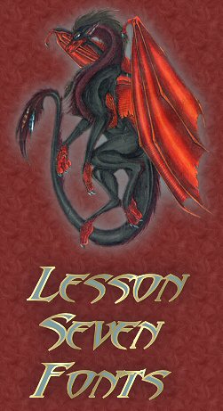
This lesson is all about Fonts. How to "match" them to the graphics used. Both in style and color.
I learned an important lesson on the second page of this lesson :-)
Because of what I learned working on that pages graphic, I will give you two fonts to download so you can see the difference on this page if you choose :-)
The first is Abaddon which is the font I used in the top graphic and the buttons.
The second is AncientScript and this is what it looks like:

All you have to do is download them to a folder and open them, minimize them and then "refresh" the page. You should see something quite different!!
We also learned another way to add "special", fonts that are not standard, text to a page, to see how that looks, and the problem I discovered, click Here.
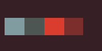
Here's the color swatch I made and used for this page. I still can't get over how handy the swatch is!
![]()
This page was fun for me, although very challenging :-) My favorite creatures are dragons and my favorite color is red...sometimes I Have to answer the call and do something with them!! This is a bit dramatic, but I Love it :-)


This site is best viewed at 1024x768.
