This Wonderful Graphic is by Alan Giana, visit his web site Here
![]()
Lesson 4 is Side Borders. Here we learned if we used a "spacer", a transparent gif the size of our border picture, the text and doodads in the web set are centered in the remaining space! What a neat trick!!
To see what this format looks like without the "spacer", go Here
This is my favorite type stationery to make right now, the simple side border, although I usually have "floaties" drifting through the page :-) And the page scrolls. I'm really looking forward to the JavaScript lessons!! LOL
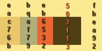
This was the color swatch I made and used for this page. I have to say I have fallen in love with using the swatch! No more lost colors!
![]()
Gosh, this page Really needs some music.........soon I hope :-)



This site is best viewed at 1024x768.
